
Do Customer Photos Increase Shopify Conversion Rate?
The famous stat says customer photos lift conversion by more than 100%. The same study says 3.8% when you measure everyone. Here's what the gap between those two numbers is actually telling you.

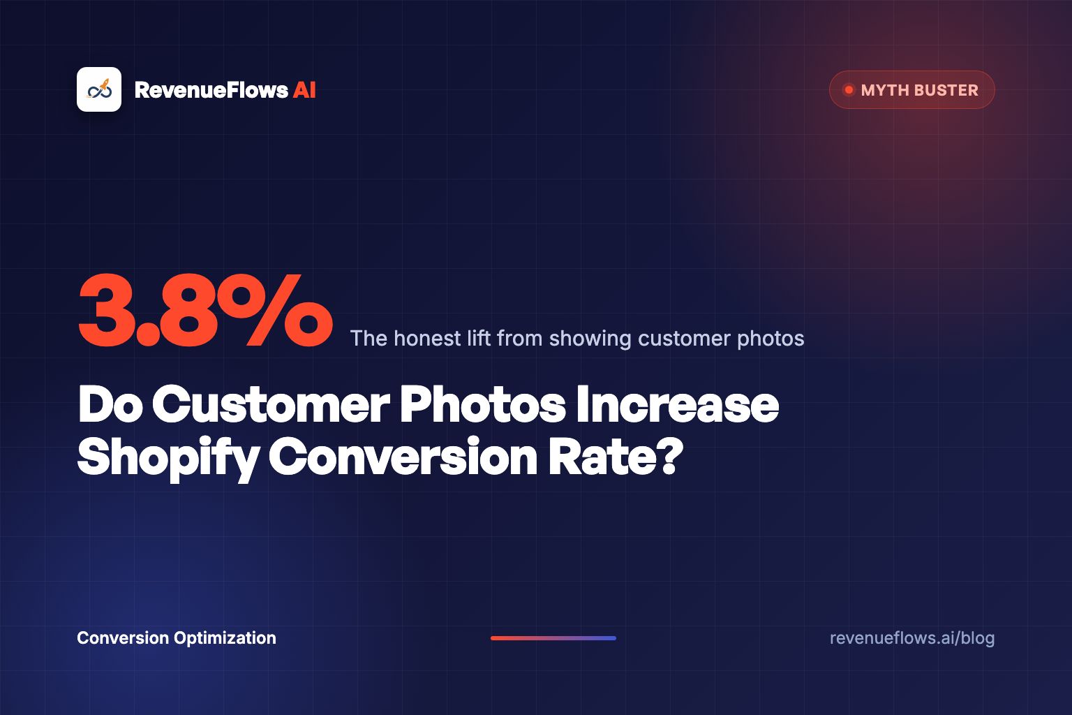
Do customer photos increase Shopify conversion rate? Yes, but nowhere near as much as the statistic in every app store listing claims.
The number you have seen quoted is a lift above 100%. It comes from a real study of real product pages, and it is being used to sell you software. That same study, an analysis of 1.5 million product pages across more than 1,200 brand and retailer sites, reports two figures side by side. Among visitors who were shown user-generated content, conversion rose 3.8%. Among visitors who interacted with it, conversion ran 102.4% higher than average, and specifically for user-generated photos, 103.9% higher.
Both numbers are true. Only one of them is a decision you can make.
The 3.8% is what happens when you put photos on the page. The 103.9% is what happens to people who were already reaching for the photos, which is a group that was going to buy at a higher rate no matter what you showed them. Confusing those two is why founders install a photo widget, see nothing, and decide social proof does not work in their category.
It works. It works when a photo answers a specific question that is stopping a specific purchase. Everything below is about finding that question.
What do the customer photo studies actually measure?
They measure two different populations, and the reporting almost never separates them for you.
Population one is everybody who loads the product page and sees photos in the layout. That is the group you control. Adding customer photos moved that group 3.8%.
Population two is everybody who clicked a photo, opened the gallery, scrolled the grid, or filtered by review. That is the group that converts 103.9% higher. But think about who clicks a customer photo. Not the person who bounced in four seconds. Not the person comparison shopping across six tabs at the browsing stage. The person who opens a customer photo gallery has already decided they want the thing and is now looking for a reason to feel safe.
Measuring conversion among people who interacted with your photos is like measuring conversion among people who opened the size chart. You have not found a lever. You have found a group of buyers.
The same report shows the pattern even more starkly elsewhere: interaction with question-and-answer content is associated with a 177.2% conversion lift. Nobody believes that adding a Q&A tab makes shoppers 177% more likely to buy. What it tells you is that a shopper who types a question about your product is close to buying, which is useful, and worth knowing, and not at all the same claim.
So use the honest number as your baseline expectation. Somewhere around 4% lift for showing photos at all. Then earn more than that by placing them where they do work.
Why the survey numbers are also softer than they look
The other family of statistics you will see comes from consumer surveys. Bazaarvoice's research reports that a large majority of shoppers say customer photos and videos make them more likely to buy, with figures typically in the 60% to 70% range depending on the year and the panel.
Stated preference is not behavior. People also say they read ingredient labels and compare warranties. What surveys are good for is telling you the direction of a preference, not the size of a revenue change. Treat them as evidence that buyers want the reassurance, then go find out what they want reassurance about.
Where do customer photos actually change the outcome?
In categories where the buyer's blocking question is visual and the studio photo is suspect.
That is the whole rule. Everything else is decoration.
A studio photo is lit, styled, shot on a model chosen for the product, and rendered in a color space that flatters. Buyers know this. In some categories they do not care, and in others that knowledge is exactly what stops the order. Customer photos matter in the second group, and barely register in the first. AI scenes flatter even harder, which is why the AI product photo generators belong in the secondary gallery slots and never in the hero.
| Category | The blocking question | Do customer photos move it? |
|---|---|---|
| Apparel and swimwear | "What does this look like on a body like mine?" | Heavily. This is the strongest case there is. |
| Cosmetics and hair | "Is that shade real on my skin tone in normal light?" | Heavily, when shown by skin tone or hair type. |
| Furniture and rugs | "How big is this actually, in a room like mine?" | Heavily. Scale is impossible to judge from studio shots. |
| Jewelry and watches | "How does that size read on a wrist or a hand?" | Strongly. Millimeter specs mean nothing to most buyers. |
| Home decor and art | "Does the color match what my screen shows?" | Moderately. Color truth is the whole argument. |
| Supplements and consumables | "Does it work?" | Weakly. A photo of a tub proves nothing. Reviews do the work. |
| Electronics and appliances | "Will it do the job and last?" | Weakly, except for installed-in-place shots. |
| Golf simulators, saunas, gym equipment | "Does it fit my space?" | Strongly, and almost nobody uses them this way. |
Look at the pattern in that table. Photos win where the gap between the studio and the living room is a source of doubt, and lose where the product's value is invisible.
If you sell magnesium capsules, twelve customer photos of the same white bottle on the same kitchen counter will not move your conversion rate by 4% or 0.4%. Your buyer is not asking what the bottle looks like. Spend that page real estate on the third-party test, the dosing schedule, and the return policy instead.
Which question is the photo answering?
Every customer photo that earns its place does exactly one of five jobs. Name the job before you place the photo.
1. Scale. The single most underrated one. A rug looks enormous in a studio and arrives looking like a bath mat. Furniture brands lose orders to this daily and answer it with a dimensions table that nobody can visualize. One customer photo of the sofa against a normal wall, with a caption reading "72 inch sofa in a 12 by 14 living room," does more than the entire specs section.
2. Color truth. Screens lie, and buyers have been burned. This is the whole argument in cosmetics, paint, dyed textiles, and anything sold as "sage" or "oat" or "bone." Customer photos taken in daylight and in indoor lamp light, side by side, settle it. A cosmetics product page that shows a shade on four skin tones in ordinary bathroom light outsells one that shows it on a single model under a ring light.
3. Fit on a body like mine. The reason apparel gets the biggest lift from customer photos of any category. Not because photos are pretty, but because a 5'2" buyer at a size 14 cannot infer anything from a 5'10" sample-size model. Photo galleries filterable by height and size are the single highest-value build in fashion product pages, and most brands ship an unfilterable Instagram wall instead.
4. In a real environment. For anything installed, assembled, or space-hungry. The garage with the simulator in it. The corner with the sauna. The nursery with the crib. This is the category where the photo does the job that no amount of copy can do, and it is criminally underused on high ticket pages where a single fit doubt costs you thousands.
5. Durability over time. The 6-month photo. The 200-wash photo. The leather after a year. This one is rare because it requires you to ask customers months later, which almost nobody does, and it is the most persuasive photo on the internet for anything premium priced.
If you cannot say which of those five a photo is doing, it is decoration. Decoration is fine on a homepage. On a product page it is competing with the buy button.
Why do most customer photo walls do nothing?
Because they were installed as a feature, not built as an answer.
Here is the shape of the failure, and I see it on most stores I audit. A grid of thumbnails, 40 to 300 images, dropped between the reviews and the footer. No captions. No filters. No ordering logic. Mixed lighting, mixed quality, a few pictures of pets that are unrelated to the product. On mobile it renders as a horizontally scrolling strip of images cropped square, which cuts off the exact part of the garment the buyer wanted to see.
Six specific reasons those walls flatline:
- They are below the decision. Most buyers decide above the fold and in the first two scrolls. A photo wall three screens down is seen by the minority who were already sold.
- They have no captions. A photo without context is a picture. A photo captioned "5'4", size 12, wearing a medium" is an answer. Captions turn images into evidence.
- They cannot be filtered. Filtering by size, skin tone, room type, or model is the mechanism that lets a buyer find the photo that resembles them. Without it, they scroll five images and quit.
- They are cropped wrong on mobile. Square crops on a portrait photo of a full outfit removes the shoes and the hem. Which is often the thing being evaluated.
- They are not selected. Every photo you display should be chosen. Auto-importing every tagged Instagram post fills the widget and dilutes the evidence.
- They load slowly. A photo grid that pushes your largest contentful paint past three seconds costs you more sales than the photos win back. Lazy load below the fold, always.
Fixing the placement, not the quantity, is where the money is. This is the same failure mode as every other trust element on a page: star ratings do their work near the price and nowhere else, and customer photos work beside the claim they prove.
How do you place customer photos so they get used?
Anchor each photo to the doubt it kills, and put it where the doubt occurs.
That means breaking up the gallery. Instead of one wall at the bottom, you get four or five small clusters through the page:
- Beside the size selector: two to three photos of real customers with height, weight range, and size worn in the caption. This is where fit anxiety happens, so this is where the answer goes.
- Beside the dimensions or specs: the scale shot, captioned with the room size. For furniture, mattresses, saunas, and simulators, this is the highest value placement on the entire page.
- Beside the color or shade picker: the daylight and indoor-light comparison, ideally on more than one skin tone or wall color.
- Beside the warranty or care section: the six-month and one-year photos. Nothing sells a $400 bag like a customer photo of that bag at 18 months looking better than new.
- Inside the reviews: photo-attached reviews sorted to the top, because a review with a photo is the format buyers trust most.
Then make the photos reachable. Since the measurable lift lives in interaction, the design goal is to get more shoppers to touch the content, which means bigger tap targets, a visible "see 214 customer photos" link near the top, and filters that are actually usable with a thumb.
One more thing that costs nothing: ask better. Most brands send a review request that says "leave a review." The brands with useful photo libraries send a request that says "reply with one photo of it in your living room and tell us your room size." You get what you ask for, and the answer-shaped request produces answer-shaped photos.
What does this do to revenue per visitor?
Run the math on a store like this, hypothetically. A furniture brand converting at 1.1% with a $640 average order value. That means revenue per visitor is $7.04. On 10,000 monthly visitors, that's $70,400.
Now the scale shots move up beside the dimensions, each captioned with the room size, and the ottoman gets photographed in the same rooms so it sells alongside. Conversion rate 1.45%, average order value $710. Revenue per visitor: $10.30. Same 10,000 visitors, same ad spend: $103,000.
That's a $32,600 monthly difference from re-placing photos the brand already owned, sitting unused in an app.
Notice what did not happen there. Nobody doubled a conversion rate off a photo widget. The gain came from a 0.35 point conversion improvement and a $70 order size improvement, which is the ordinary, unglamorous way these numbers move.
The pattern showed up at a larger scale on a bedding brand that was stuck at a revenue ceiling. Before, their conversion rate was 1.0% and their average order value was $125. That means their revenue per visitor was $1.25. On 10,000 visitors, that's $12,500. After we rebuilt their top three product pages: conversion rate 3.5%, average order value $231, revenue per visitor $8.10. On the same 10,000 visitors, that's $81,000, a 6.5x lift. See the full case study numbers. Real client numbers, not typical results, and not a promise of what your store will do.
Photos were one element of that rebuild among many. Anyone selling you a photo app as the cause of a 6x is selling you the wrong story.
When do customer photos hurt?
Four situations, and I would rather name them than pretend the tactic is free.
Premium products with amateur photography. If you sell a $1,400 chair and your customer photos are dim, cluttered phone shots, you have paid for studio photography and then undercut it three scrolls later. Curate hard. Ten good photos beat 200 mixed ones. This is a place where saying no to real customer content is the right call.
Products with a visible flaw. Customer photos surface reality, and sometimes reality is that the color really does run orange or the seam really does pucker. The photos are not the problem in that case. They are the diagnosis, and papering over them with a curated wall converts strangers into refunds and one-star reviews.
Regulated categories. Before-and-after imagery in supplements, skincare with treatment claims, weight loss, and anything medical adjacent carries real compliance exposure, and platform policies on health claims apply to customer content displayed on your page. Get the review before you get the traffic.
Consent and privacy sloppiness. Reposting a customer's face without documented permission is a legal problem in several jurisdictions and a trust problem everywhere. Ask, log the permission, and give people a way to have an image removed.
How do you test this on your own store?
Not with the app's dashboard. Those dashboards report attributed revenue for sessions that touched the widget, which is the exact selection-bias number this whole article is about.
Do it in four steps instead:
- Pick one product with enough traffic to reach significance in two to three weeks. Under roughly 8,000 sessions a month per page, you are not testing, you are guessing.
- Change one thing. Move the photos next to the size selector or the dimensions, with captions. Leave everything else alone.
- Measure revenue per visitor, not conversion rate. Photos that answer a fit question usually reduce returns and lift order size at the same time, and a conversion-only readout hides half the win.
- Watch returns for 60 days. The most valuable outcome of good customer photos on an apparel page is often a lower return rate rather than a higher conversion rate, and returns show up on a lag.
If your traffic is too thin to test, skip the test and use judgment: place photos against the five jobs listed above, caption them, and move on to a bigger lever. Most stores under 10,000 sessions a month have larger problems than photo placement, and the full social proof stack on a product page is a better place to spend the same afternoon.
What to do next
Open your best-selling product page on your phone. Scroll to your customer photos and read the first six as if you were deciding. Ask which of the five jobs each one is doing: scale, color, fit, environment, durability.
If the answer for most of them is "none," you do not have a photo problem. You have a placement problem, and the fix is an afternoon of moving images next to the claims they prove and writing one line of caption under each.
Get your free profit audit and we'll show you exactly where your product page is losing buyers, then rebuild it into a high-converting product sales page in less than 15 minutes.
P.S. The most persuasive customer photo most brands could publish this month already exists in their inbox: the one a customer sent 8 months after buying, unprompted, of the product still in daily use. Nobody asks for it. Ask for it.
Frequently asked questions
Do customer photos increase Shopify conversion rate?
Yes, but far less than the popular statistics suggest. The largest public analysis found a 3.8% conversion lift among all visitors who were shown user-generated content, while the 100%-plus figures describe only the subset of shoppers who chose to interact with it. Those shoppers were already deep in evaluation, so that number measures intent as much as it measures photos.
How many customer photos should a product page have?
Enough to answer the blocking question and no more. For apparel that usually means five to eight photos spanning different body types, and for furniture it means three or four showing the piece in ordinary rooms. A wall of 200 uncaptioned lifestyle shots performs worse than six captioned ones because nothing in it answers anything.
Where should customer photos go on a Shopify product page?
Next to the claim they prove, not in a gallery at the bottom. Sizing photos belong beside the size selector, room-scale photos beside the dimensions, and durability photos beside the warranty line. Bottom-of-page photo walls get seen by a small share of visitors, and lift only shows up when someone actually engages with the content.
Are customer photos better than professional product photos?
They do a different job. Professional photos sell the aspiration and set the standard, while customer photos settle the doubt about whether reality matches it. The strongest pages run both, with studio images carrying the hero and customer images placed at the exact points where a buyer suspects the studio shot is flattering.
Do fake or incentivized customer photos hurt conversion?
Yes, in two ways. Buyers spot studio lighting in a supposed customer photo quickly and discount everything else on the page, and incentivized content skews toward your happiest customers, which makes your reviews less useful for answering real objections. Free photos from ordinary customers outperform a paid content library on a product page.